INFINITY DESIGN

Pharmaceuticals · Concept and design · 2025

Bionorica.
Corporate calendar design

Science and nature brought together in a coordinated desk and wall calendar set, with a shared visual concept and layouts tailored to daily planning.

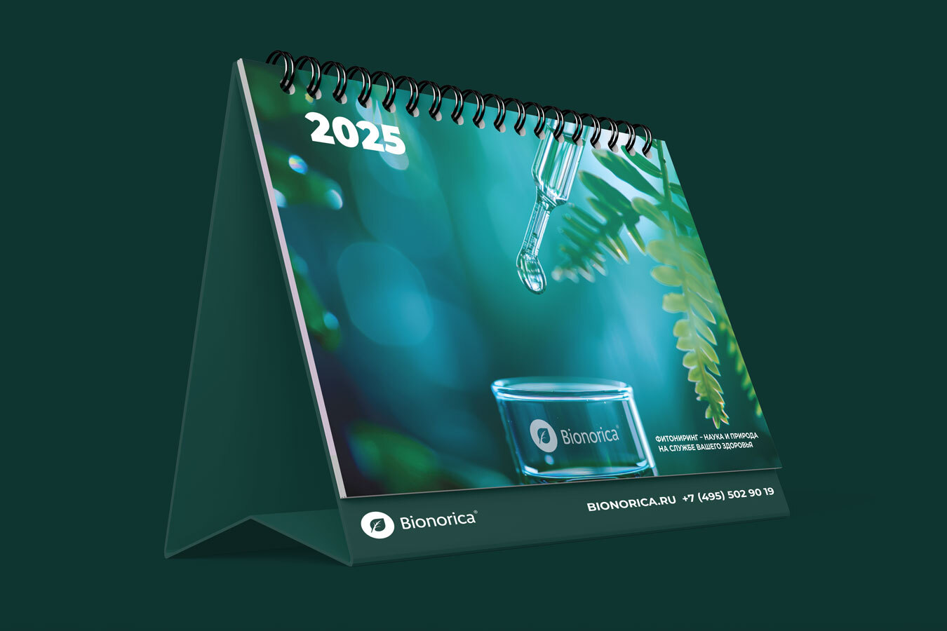
Bionorica 2025 desk calendar cover with a laboratory pipette, a droplet and botanical elements in a green and teal palette
Bionorica desk calendar

The brief

Develop the concept and design for a Bionorica calendar set. The wall calendar and flip desk calendar needed to belong to the same visual family, reflect the character of the pharmaceutical brand and remain practical tools for everyday planning. Our scope covered the visual concept and its adaptation to both formats.
The concept

The visual combines botanical forms with laboratory imagery. A pipette, droplet and transparent glass express the scientific theme; leaves introduce the natural element. A deep green and teal palette, highlights and white typography connect the composition. This shared image becomes the starting point for two different calendar structures.

Wall calendar

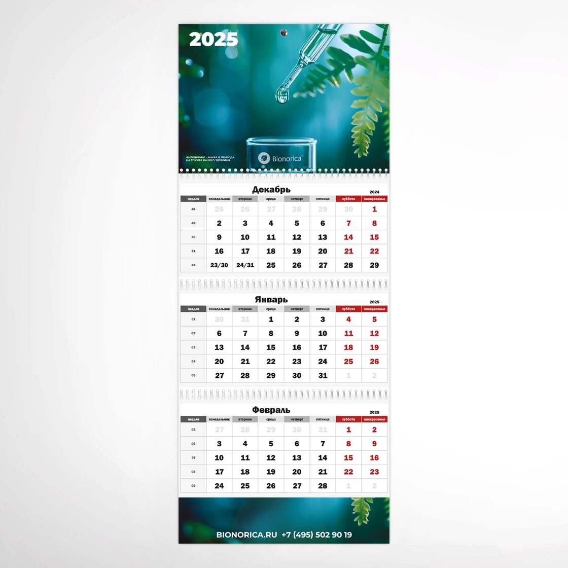
Bionorica wall calendar with a branded header, three consecutive months and contact details at the bottom
Bionorica wall calendar

The main image occupies the top panel. Below it, the calendar stays light and high-contrast, with large dates, week numbers and highlighted weekends. Three consecutive months appear together, keeping the planning area separate from the richer visual treatment above.

The lower panel extends the header graphics and carries the brand’s contact information. This creates a visual connection from top to bottom while leaving the date grids clear and easy to scan.

Desk calendar

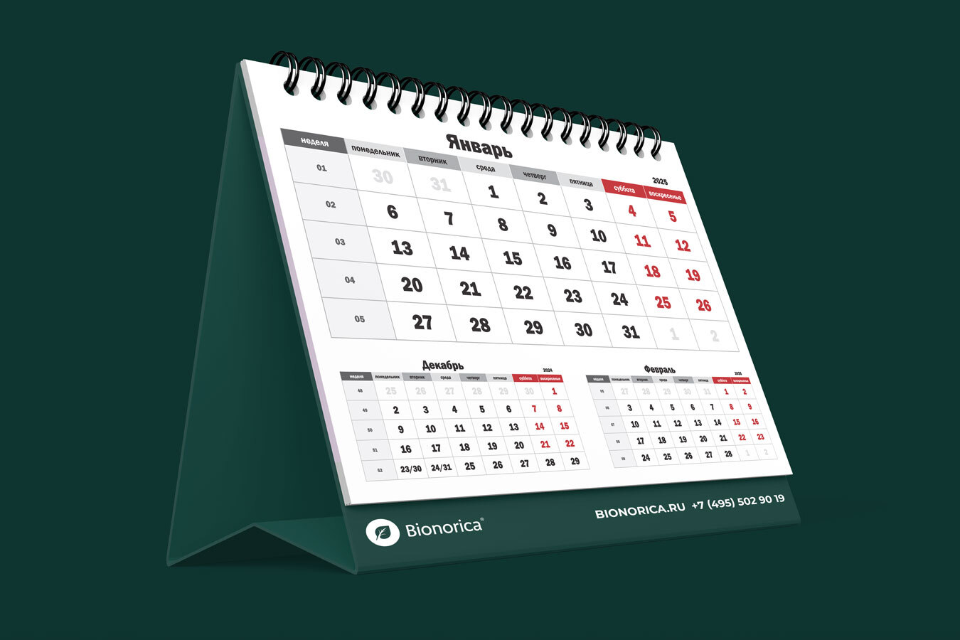
Bionorica desk calendar page with the current month, two adjacent months and brand details on the fixed base
Bionorica desk calendar page

Each inside page gives most space to the current month. Compact grids for the previous and following months sit below it, placing nearby dates within reach without turning the page. The information hierarchy is adapted to the smaller desk format.

The logo and contact details sit on the fixed base, so they remain visible as the pages change. The green and teal palette connects the practical interior pages with the cover and the wall calendar.

One concept, two formats

Our deliverables comprised the shared visual concept, cover designs, calendar grids and permanent branded elements. We adapted image scale, logo placement and page structure to each format. The result is a coordinated calendar series in which the same concept supports two different ways of planning: a wall display and a compact flip calendar for the desk.

Let’s discuss your next project

We develop visual concepts and adapt them for calendars and corporate print materials. Send the formats, content and brand guidelines you have available to discuss the scope.