INFINITY DESIGN

Packaging · Artwork adaptation · Prepress

TeploKNAUF.
Packaging artwork
and prepress

A packaging system for Expert and Expert Comfort: brand graphics, product information and production artwork coordinated across two variants.

The brief

Develop packaging artwork for TeploKNAUF Expert and Expert Comfort, organise the brand assets and product information on the dielines, and prepare the layouts for print. The two products needed a recognisable family appearance and clear differences between variants.

Our approach

We built a shared layout for both variants and assigned a role to each panel. Product names and benefits lead on the front, shorter messages repeat on the sides, and technical information occupies a dedicated area. We adapted the graphics to the panel boundaries, folds, flaps and cutting contours.
01

Two variants.
One visual system.

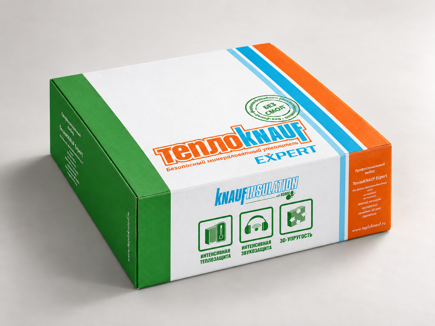
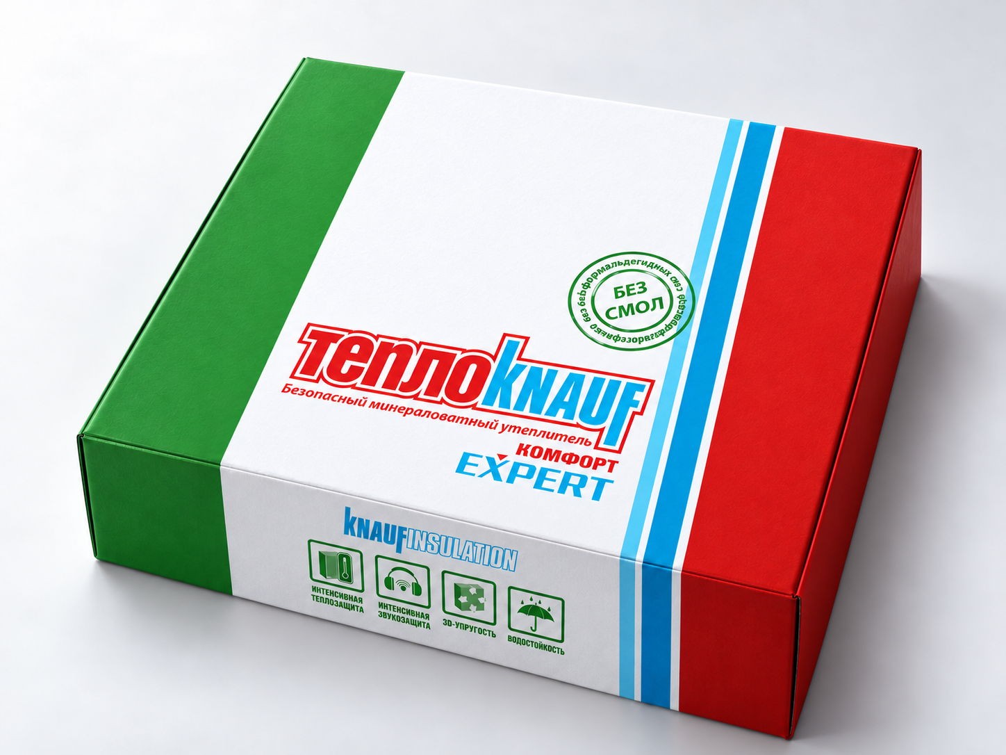
A white central field, green side panels and blue stripes give the range a consistent structure. Orange identifies Expert; red identifies Expert Comfort. The product name and grouped benefit icons establish the reading order. The variant colours change while the underlying layout remains familiar.

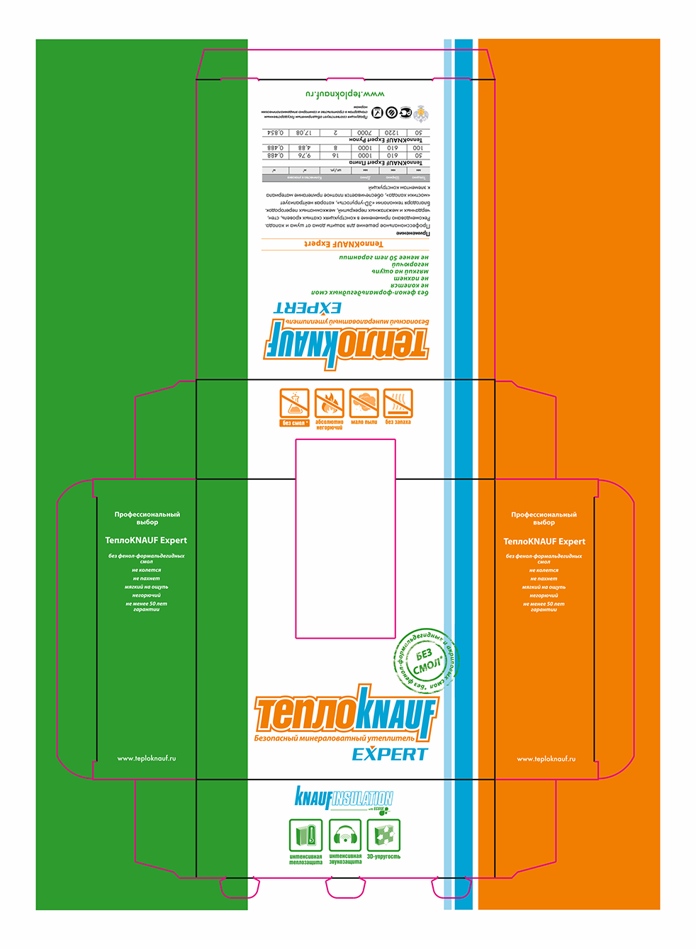
TeploKNAUF Expert

TeploKNAUF Expert packaging dieline with green and orange panels, brand graphics and cutting lines
TeploKNAUF Expert

Orange connects the product name, benefit icons and side panel. Composition, applications and specifications sit together in a separate information area, so detailed copy has its own place within the overall layout.

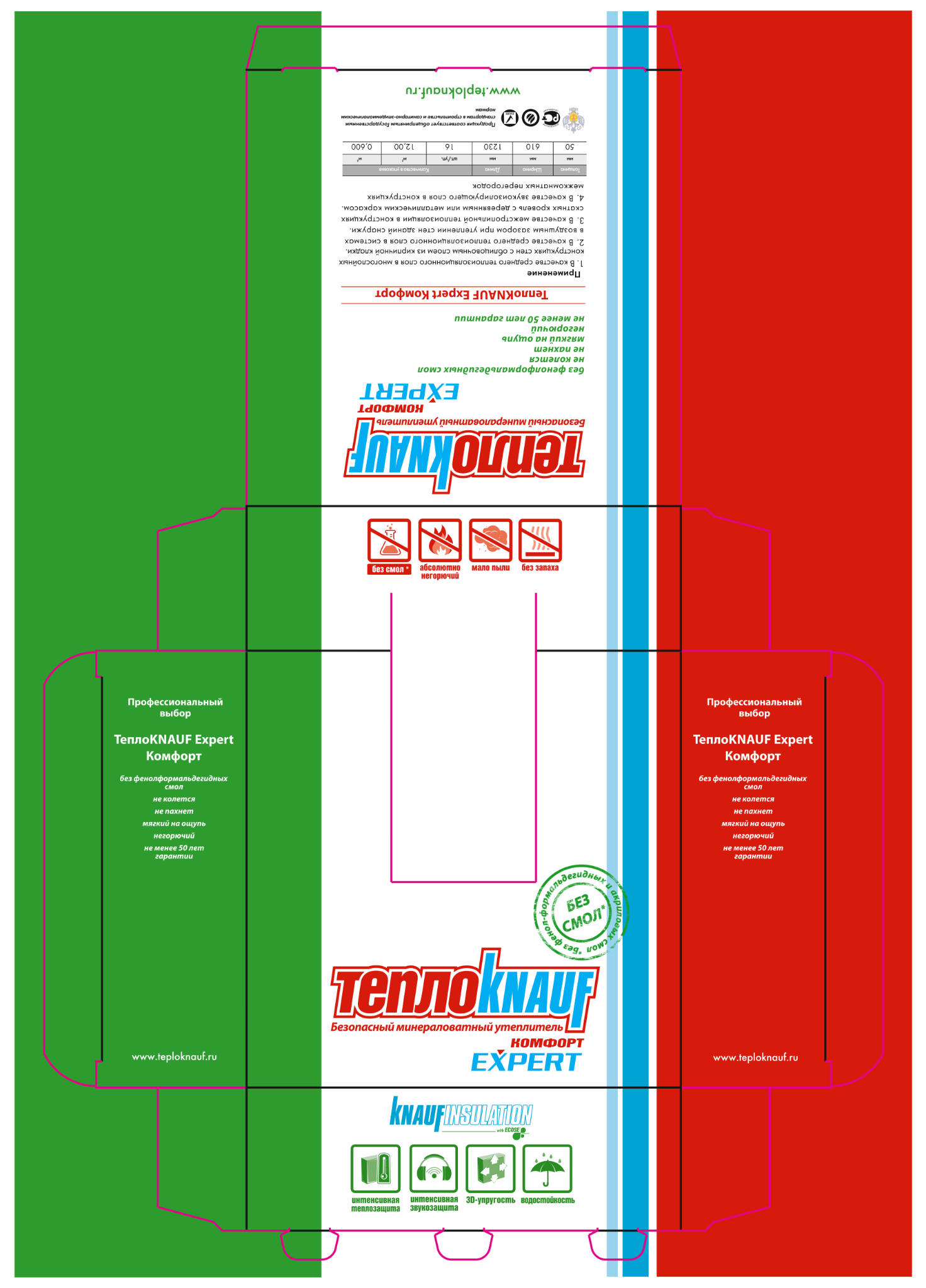
TeploKNAUF Expert Comfort

TeploKNAUF Expert Comfort packaging dieline with green and red panels, brand graphics and cutting lines
TeploKNAUF Expert Comfort

Red and the Comfort designation distinguish this product within the range. The placement of the main brand elements and the shared panel structure maintain the connection to Expert.

02

Graphics on the pack.
Precision on the dieline.

The design had to read as an assembled pack and remain coherent as flat artwork. We considered the contribution of each panel, then aligned the composition with the dieline. The artwork and visualisations show these two aspects of the same design.

01 / Information hierarchy

A clear role for each panel

The front carries the product name and principal benefits. Side panels repeat concise product messages, keeping the brand and key information present across the pack.

02 / Artwork adaptation

Graphics follow the structure

We coordinated text and brand elements with the panels, fold lines, flaps and cutting contours. This connects the visual composition to the physical arrangement of the packaging.

03 / Prepress

Artwork for both variants

We prepared the Expert and Expert Comfort layouts for print. The packaging visualisations present how the graphics come together on the assembled product.

From the visual system
to production artwork

The deliverables cover two packaging designs, information layouts for the individual panels, packaging visualisations and print preparation of the dieline artwork. Each variant retains the character of the range while using its own accent colour. The project demonstrates how a shared packaging system can be carried through to the details of production artwork.

Let’s discuss your next project

We develop packaging, adapt artwork across product ranges and prepare layouts for print. Send your brief, brand assets and available dielines to discuss the scope.